Young Poet
Arts and Culture
Evolving an indie music label that celebrates new industry standards
Democratisation of the Music Industry
The pandemic feels like a distant memory but its impact on the music industry still runs deep. Whilst artists struggled with the effects of isolation on their income, some found greater creative freedom as a result.
By utilising social media channels, artists fostered meaningful connections, engaging directly with their fanbase, collaborating freely, and releasing new music directly to their followers.
Now we see an industry needing to sustain this freedom, contributing to a post pandemic industry shift towards independent labels. Ones that have authentic relationships and give greater creative freedom over artist’s music and fanbase.
Services:
visual identity, verbal identity, Motion Identity
An evolving landscape
We worked with Young Poet, who are leading this shift, a blossoming independent label driven by a love for music and creativity.
Young Poet champion their artist's self-expression, forming a label of diverse talent and great music. Inspired by their namesake, the Young Poet’s artists are encouraged ‘to go into themselves’ to proliferate their creativity - whatever that may be.
Our task was to evolve the brand to match its founders' values and ready Young Poet for the rapidly evolving music industry. This involved identifying the creative concept through to design and execution.
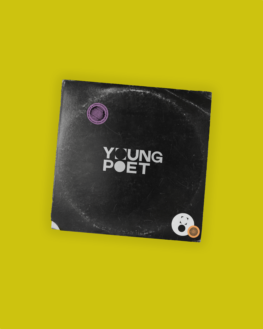
Go into yourself
Working with Young Poet revealed a shared love of all things music from the studio. From appreciators, players, and vinyl collectors. We reflected on our favourite artists old and new and immersed ourselves in the visual ephemera of the music world.
We were inspired by a quote drawn from the brand’s namesake Letters to the Young Poet, Rilke, “to go into yourself and see how deep the place is from which your life flows” encouraging self-expression and diverse creativity. We used this concept of expression as the baseline of Young Poet’s new brand.
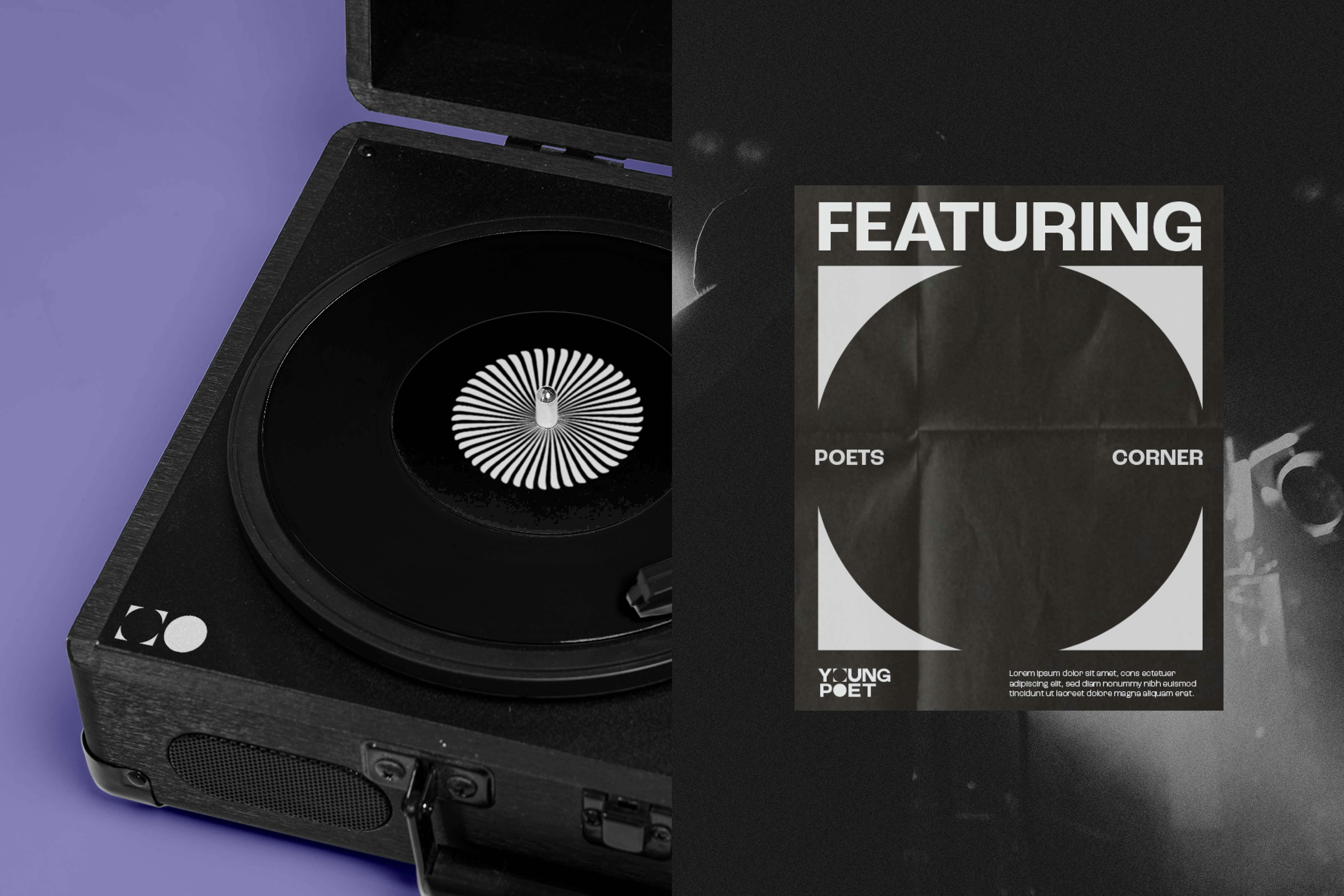
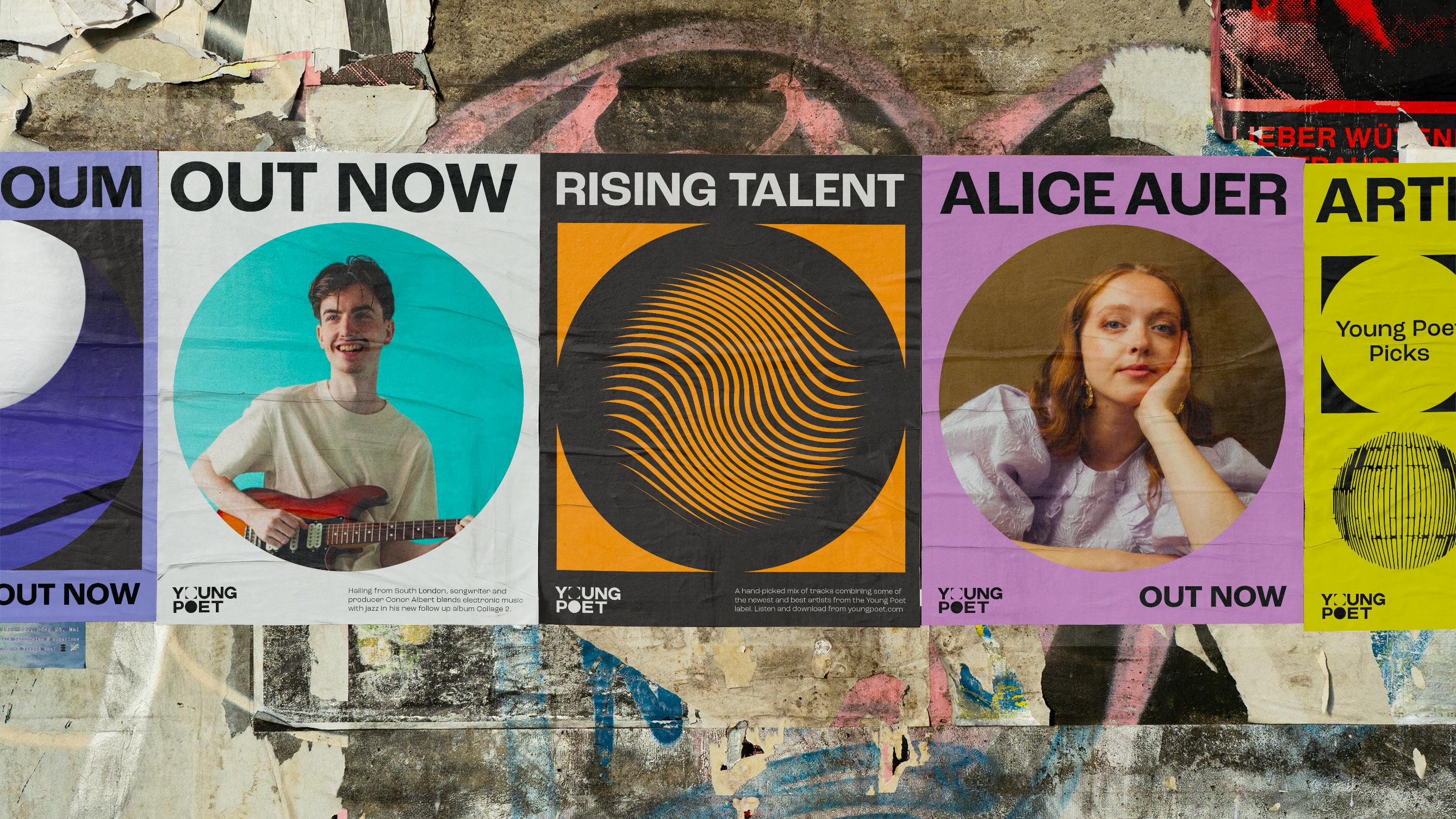
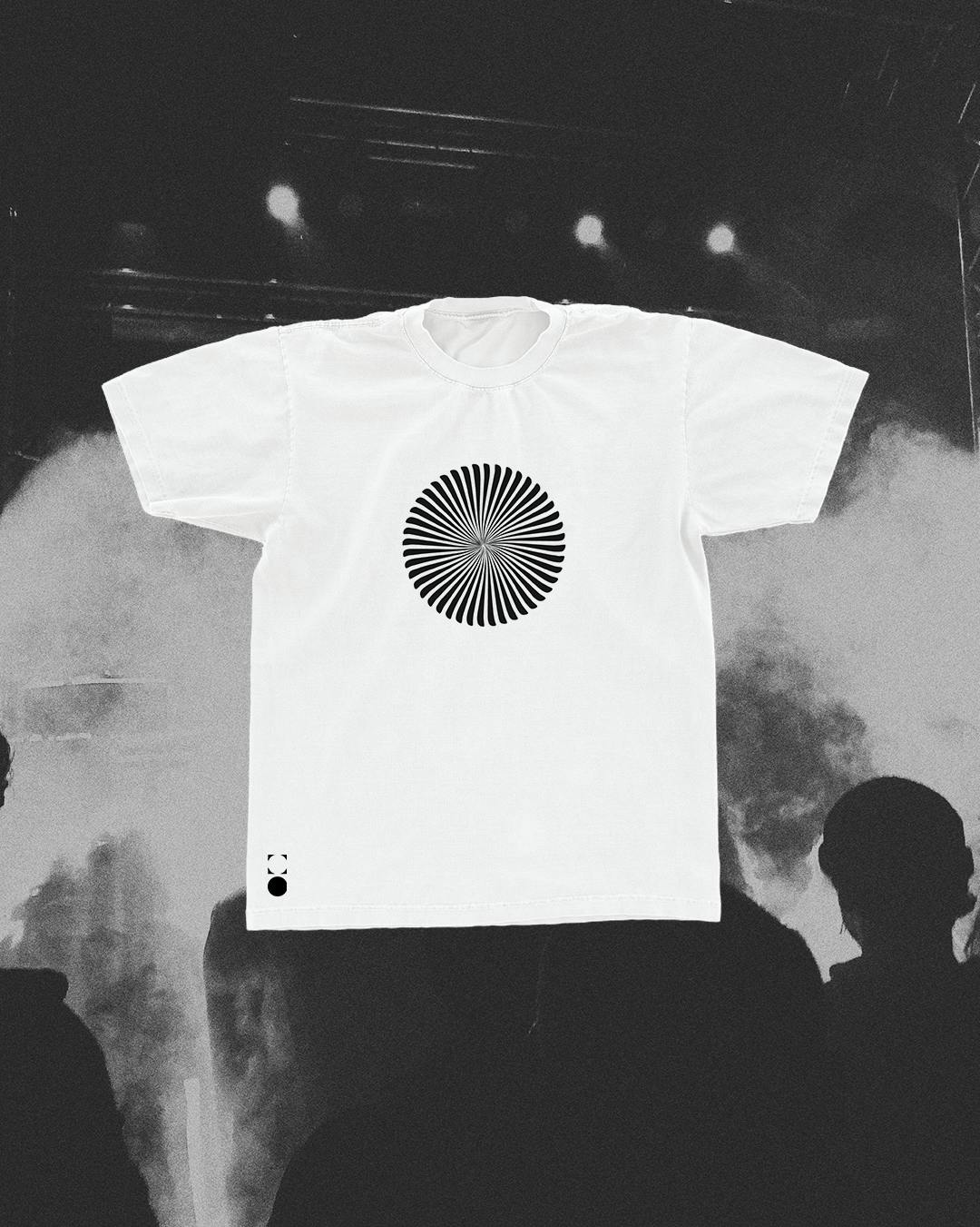
Layering unrefined sound wave textures, a muted colour palette, and a symbol representing the relationship between creator and their creativity. The result is a brand that celebrates artists’ authenticity and the infinite possibility of musical creativity, whilst nodding to our shared love of old records and over-washed band tee’s.
Hugh Worskett & Will Frank, Founders of Young Poet
“When we started this process, a strong concept was as important for us as simply looking good. Re’s development of a multi-layered brand identity has delivered on both fronts, along with a visual shorthand for everything we stand for as a record label.
It’s creative but focused, meaningful without pretence, aesthetically bold but inclusive, and gives space for our artists’ identities whilst further developing the Label’s identity in its own right.
Re’s considered approach to who we are as a business combined with their team’s engaging and challenging approach helped push the boundaries of our thinking.”
