National Breast Cancer Foundation
Not-For-Profit
It's 2017. #MeToo is about to take off
How do you stand out in a sea of pink?
Services
Brand strategy and identity design
Remaking a charity at the cutting edge
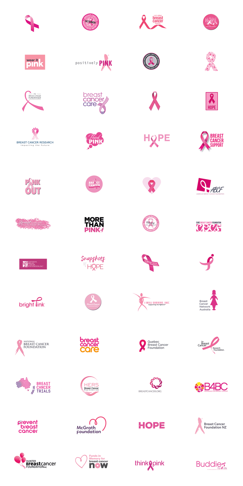
In the medical world, you don’t get diseases much more high profile than breast cancer. But while it’s a huge strength to have such recognition and awareness, the disease’s ‘popularity’ as a cause can also be a burden for breast cancer charities. Because while the most iconic symbols of the disease – the colour pink, and the ribbon – are its most recognisable, they are also its most generic. They belong to everyone and therefore, no-one.
This was how the National Breast Cancer Foundation (NBCF) came to us. In a sea of pink ribbons, it was drowning. It is the only national body that funds life-changing breast cancer research with money raised entirely by the Australian public. However, research just doesn’t produce the same emotional response as charities focused on palliative care or sufferer support. And eliciting emotional responses is how you drive donations.
Zero deaths by 2030.
We didn’t want to lose the compassion behind the charity but rebranding meant creating an identity that felt much more distinctive and determined. NBCF’s ambitious mission to stop deaths from breast cancer by 2030 was a key driver and the idea that each day, NBCF is closing in on breast cancer became the starting point for our visual language.
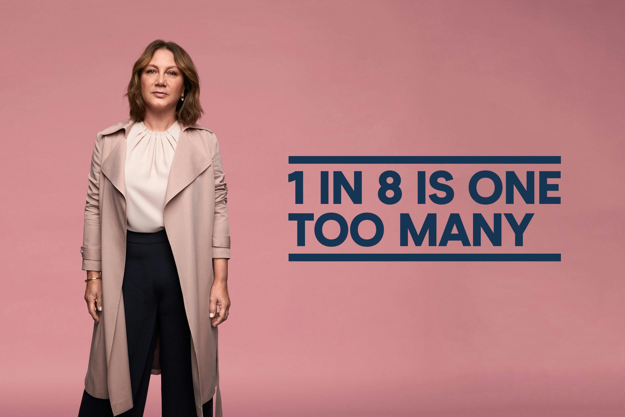
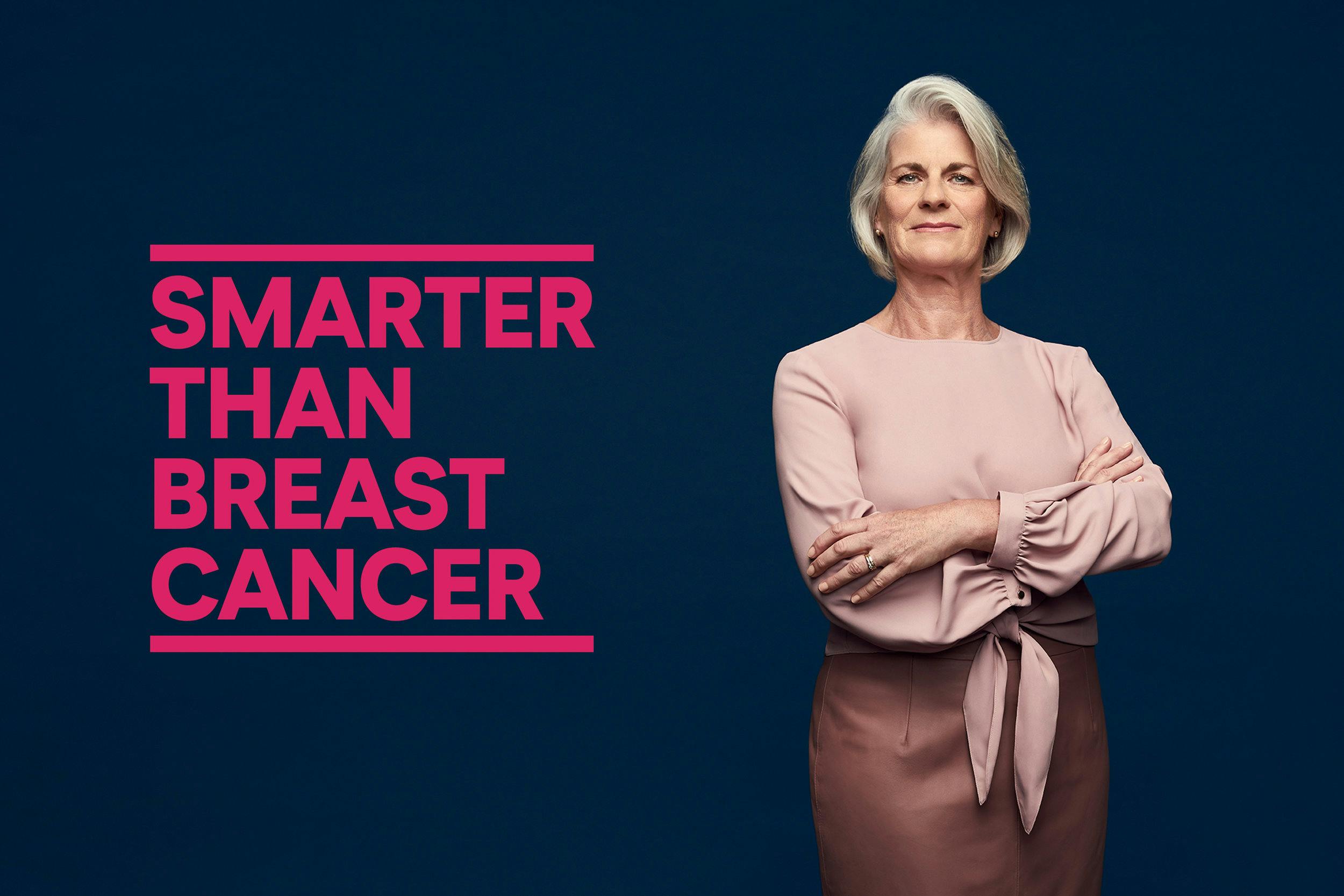
We created ‘closing bars’ that could close in on headlines, on animations, on anything that might stand in our way. Our language became more emotive and urgent – playing upon the sense that time is running out for breast cancer.
From research to real-world results.
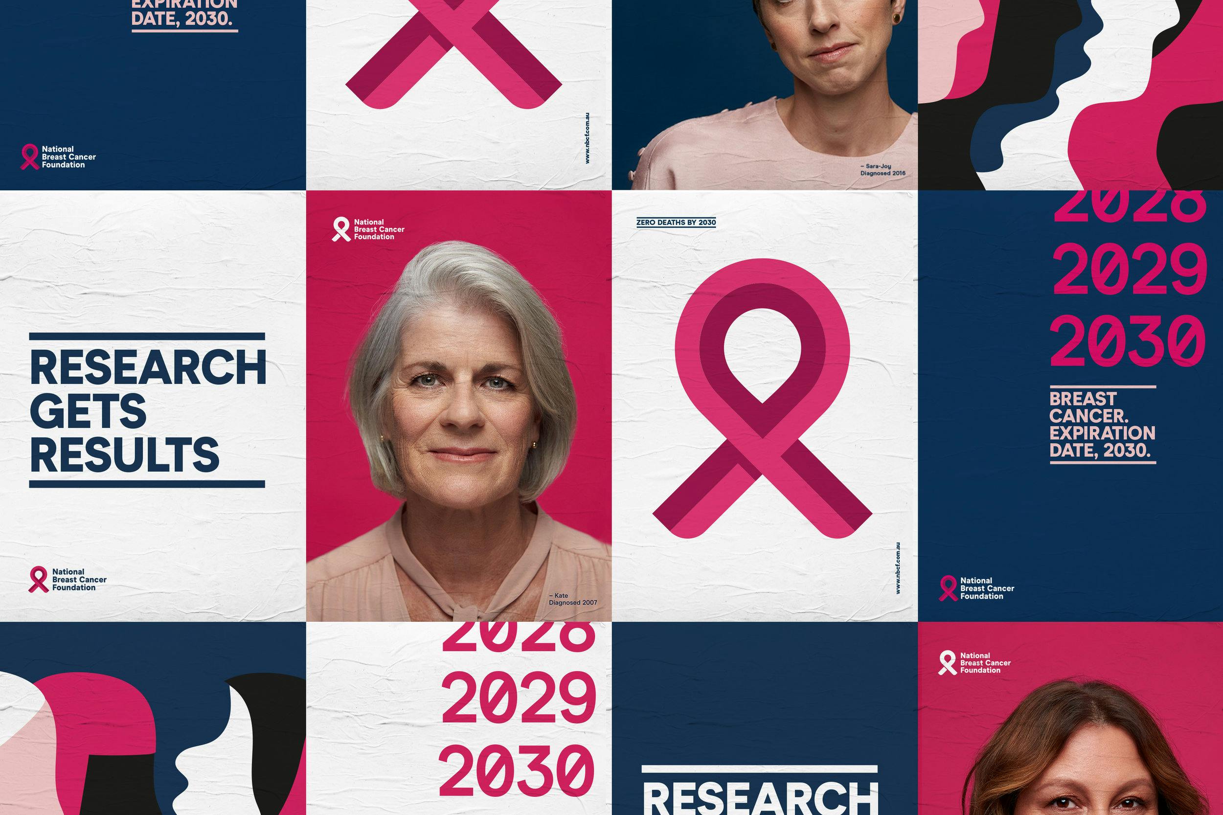
Working with photographer Damian Bennet, we captured intimate portraits of women who have dealt with breast cancer first hand. The portraits capture their honesty and warmth along with their grit and determination to survive such a relentless disease.
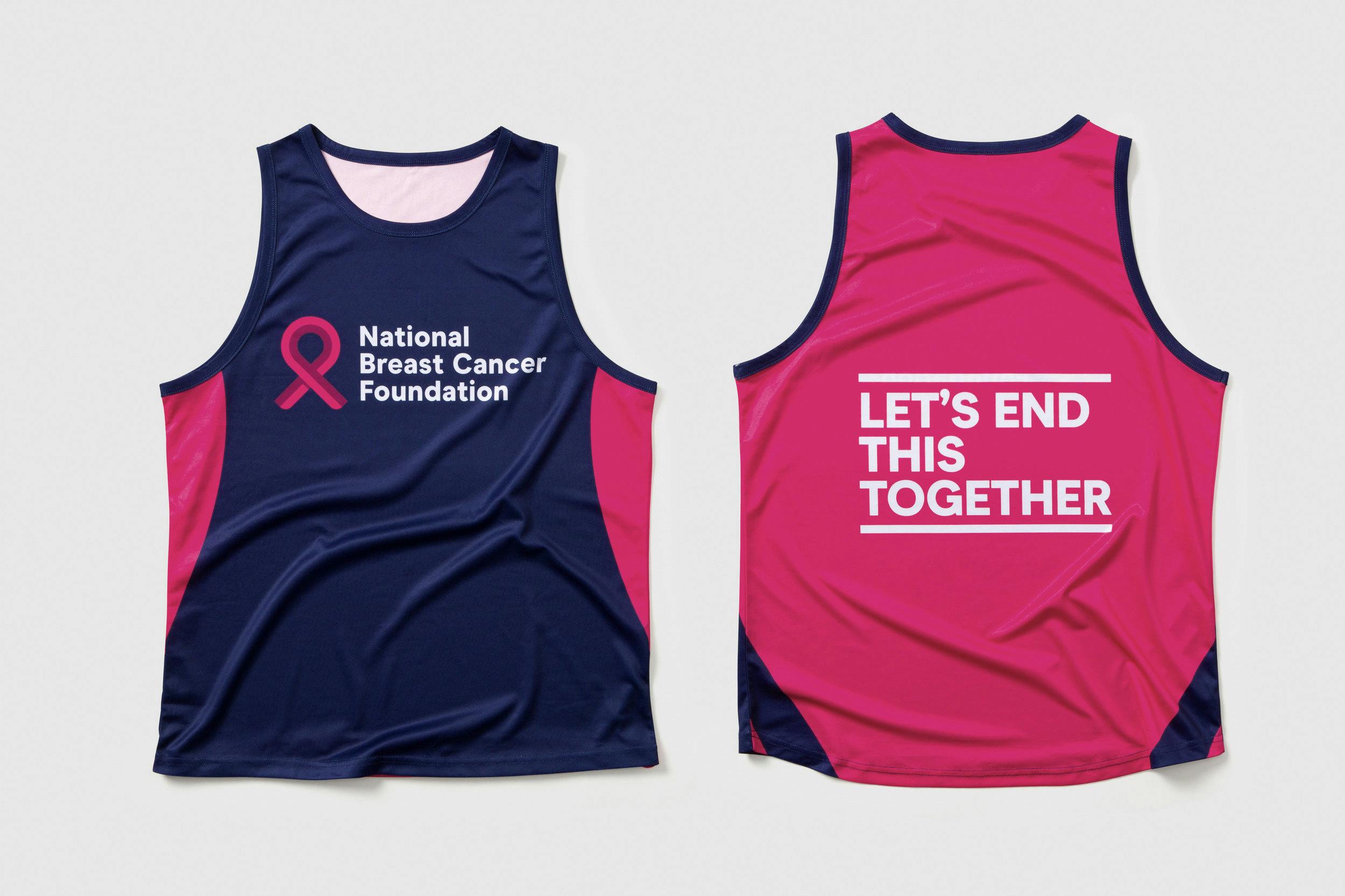
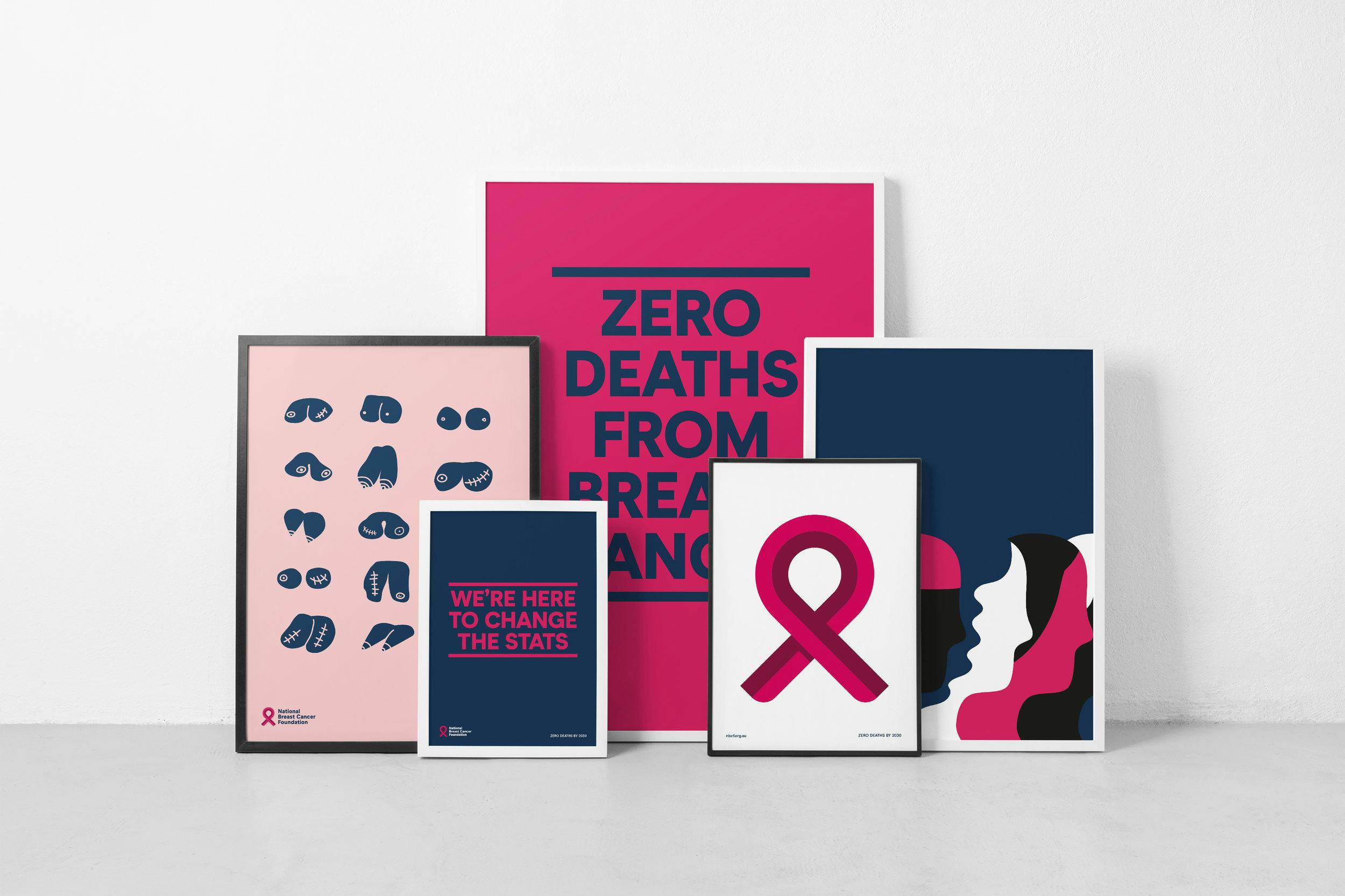
We needed a new ribbon that could hold its own and stand apart from the rest. It went from an outdated, illustrative style to a more geometric, digital-friendly form that makes a much bigger splash in that pink ocean. The brand now reflects an organisation that flexes seamlessly between the worlds of research and real-world results.
Make it pop.
A more vibrant and energetic colour palette comprising pink and navy allowed the brand to flex tonally between hard-hitting research and emotive stories of individuals, in all channels.

Thanks to
Photography:
Damian Bennett
Type Foundry:
Omse Type
