Kit
Technology
It’s 2022. Cash isn’t king. Crypto’s confusing. Don’t even ask about the cost of living.
How do you prepare kids for a financial future that’s beyond imagination?
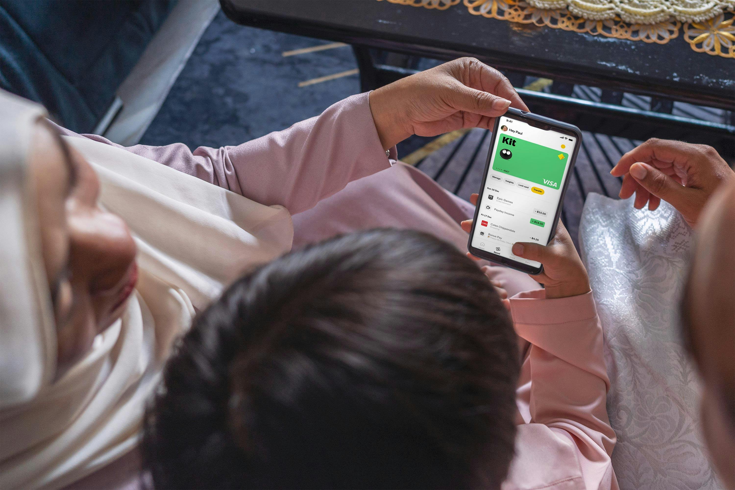
Kit is a money app for kids and their grown-ups to use together. Supported by CommBank and currently in its beta form, Kit wants to help young people do more with money.
While the concept of introducing kids to money at a young age isn’t new, doing so in an integrated app that’s educational, playful, and has an embedded intelligent agent is. So, Kit needed a brand that kids actually want to interact with. And, with the average kid spending almost 20hrs online a week, one that grown-ups can trust.
Services:
visual identity, verbal identity, user interface

What kids want
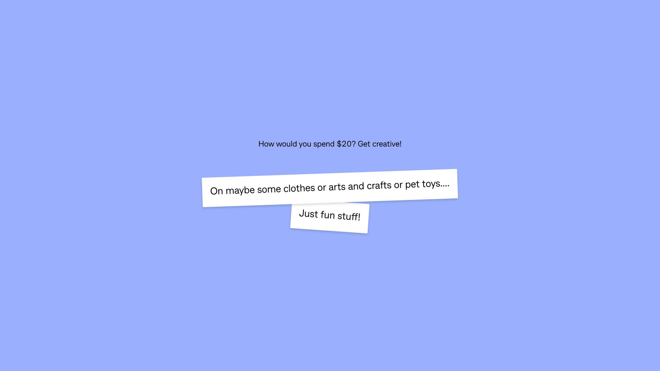
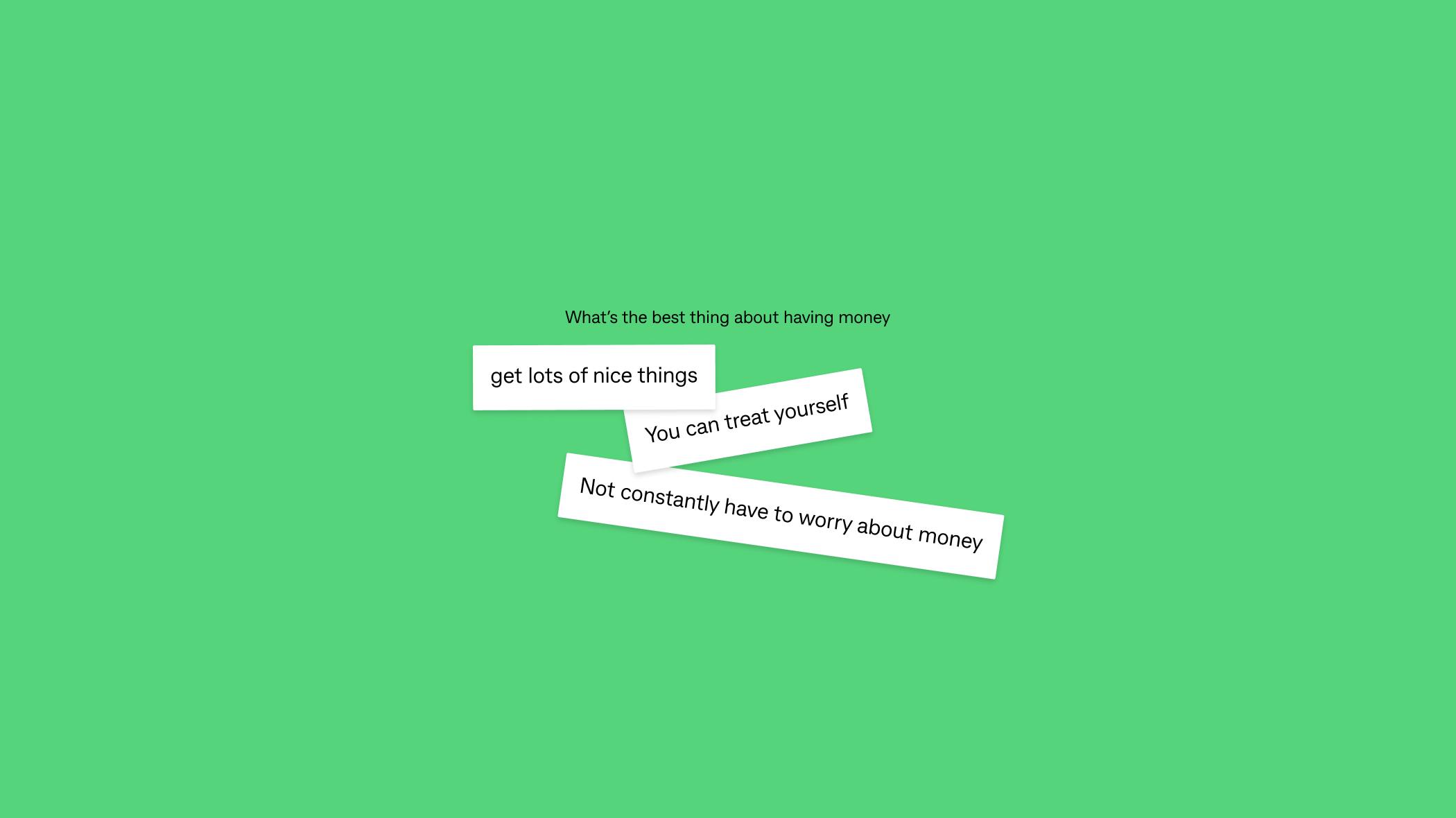
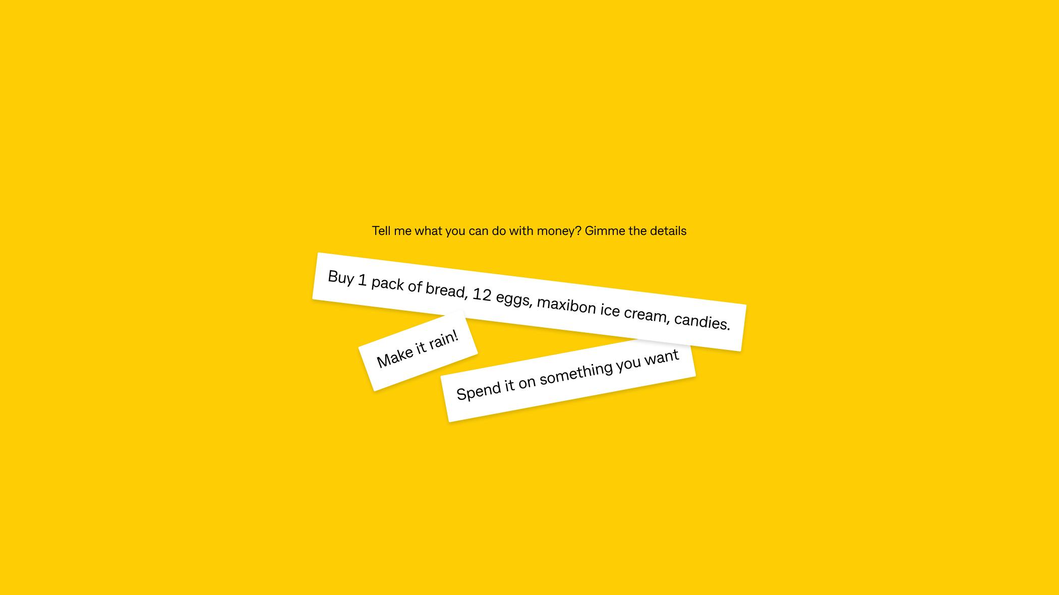
Working collaboratively with CommBank and x15, we surveyed 5-16year olds to find out what they know and think about money. What we learned is that kids are motivated by what they want and what they want can be super random. In the same breath, they want Maxibons, a mansion, and to ‘make it rain’.
Talking to kids at eye-level
Using the survey responses as a jumping off point, we developed the brand to be exuberant and quirky to ensure kids were excited to enter Kit’s universe. This led to our brand idea of ‘kids walking in a grown-up’s world’.
Working agile with a scale-up business
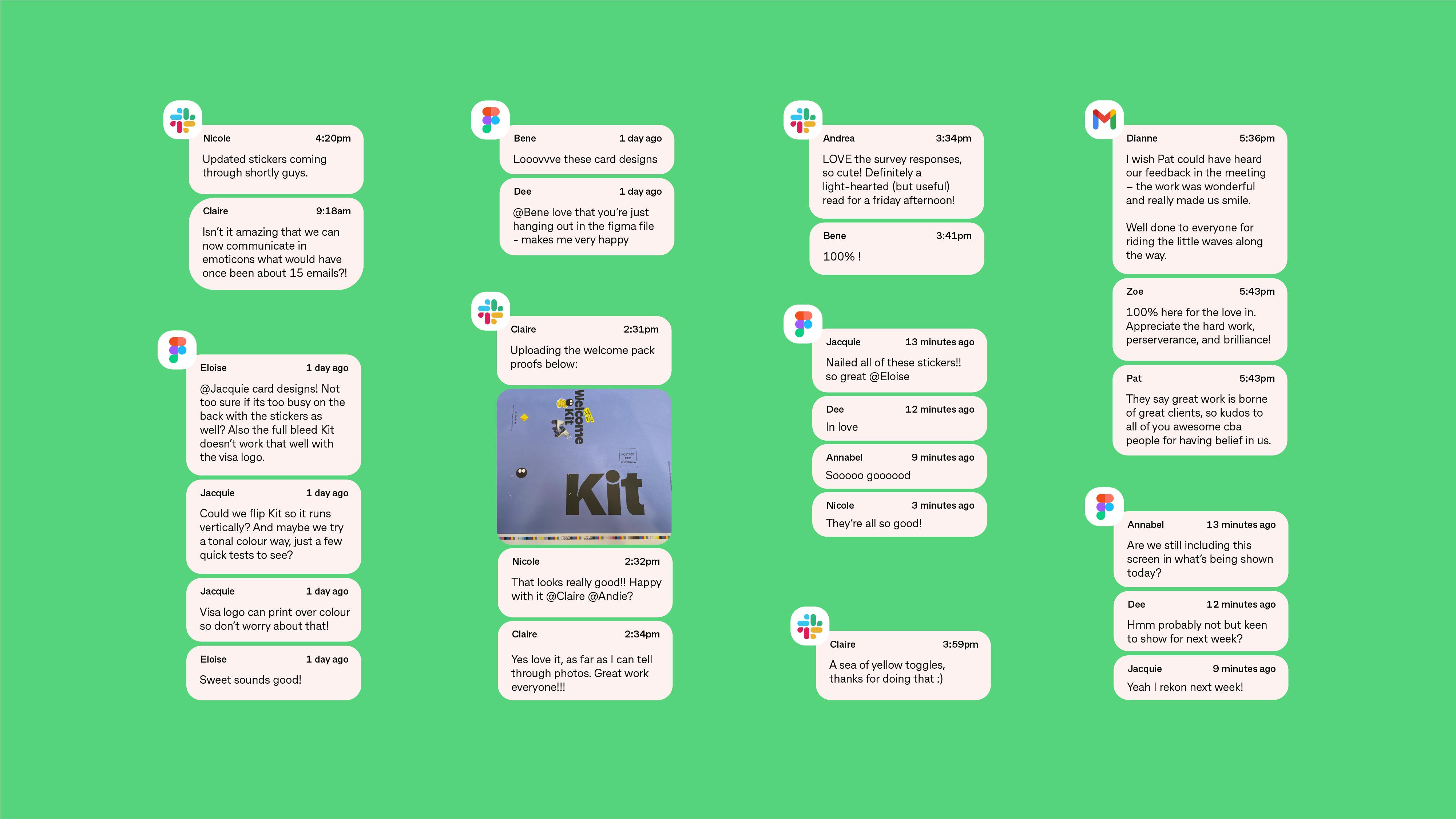
Between ourselves, CommBank and the x15 ventures team building Kit, there was a collective keenness for deep collaboration on this project. The app itself was being built in parallel to us building the brand, giving us the opportunity to directly influence Kit’s user interface and user journey. By co-creating in Figma and through discussions over Slack, we were able to uncover the best possible moments to inject our unique personality into the experience.
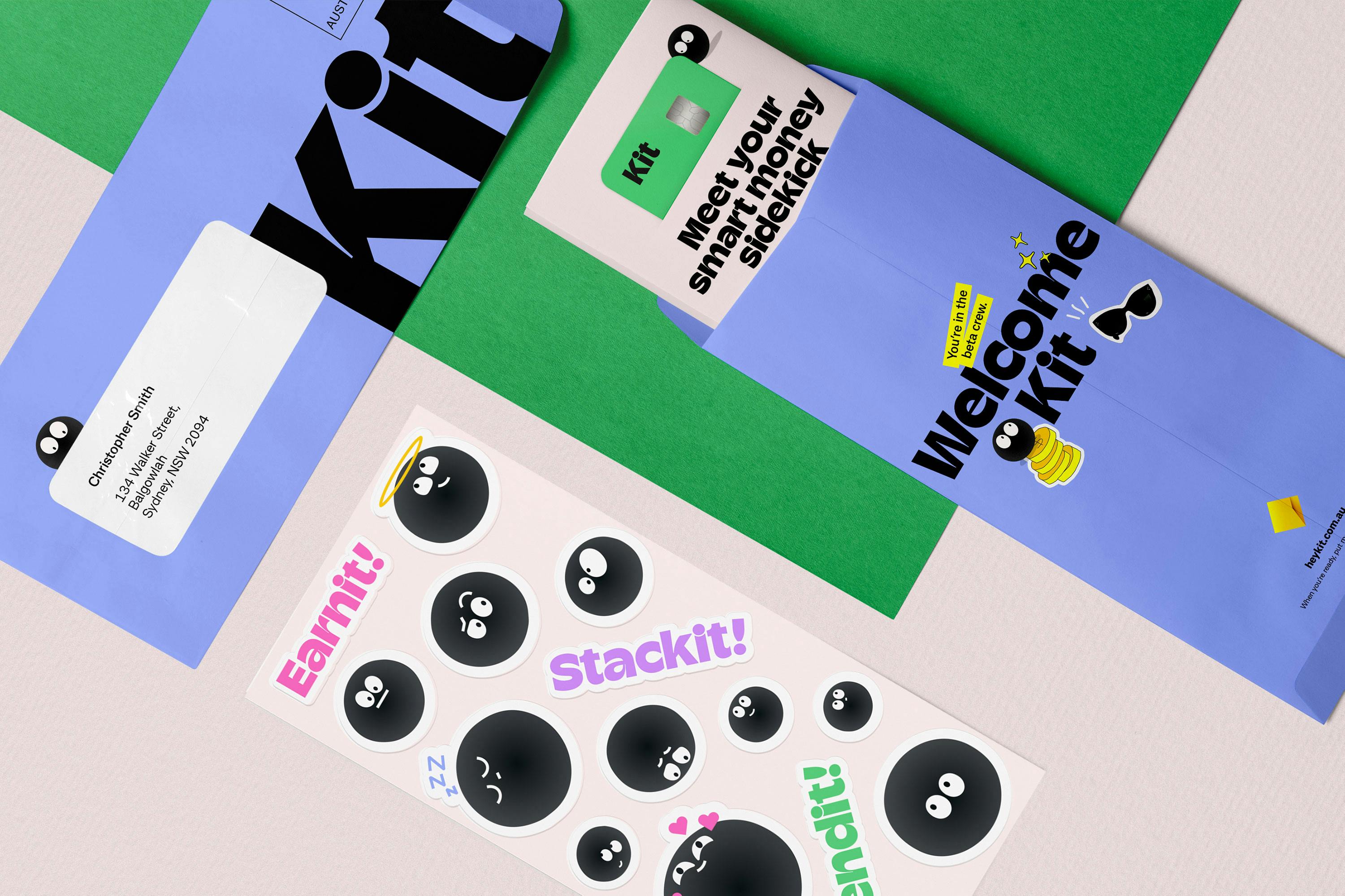
Meet your smart money sidekick
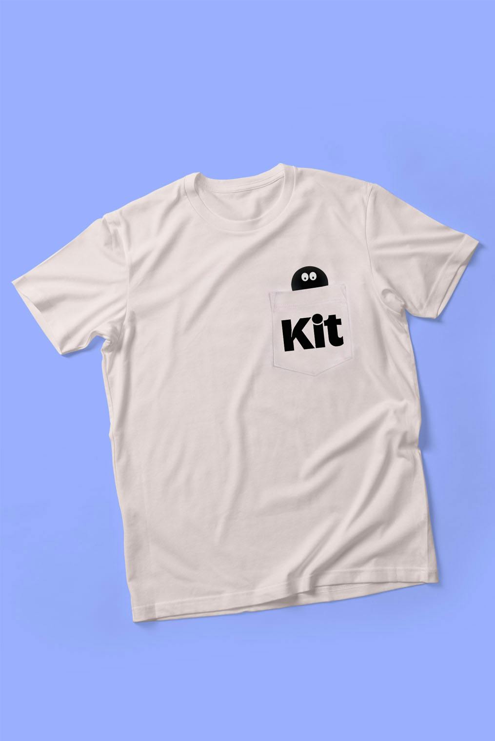
The hero character, Kit, was inspired by the tittle of the i, simple yet unified with the brand system. Cheerful and cheeky, Kit is the ultimate money sidekick for kids throughout their entire product experience.
Money-savvy kids to the front
Kit does more than just make financial education fun –it enables kids and grown-ups to learn together. The brand is equal parts playful and aspirational, ensuring kids want to keep coming back as they become more financially independent.
Kids in a grown-up world
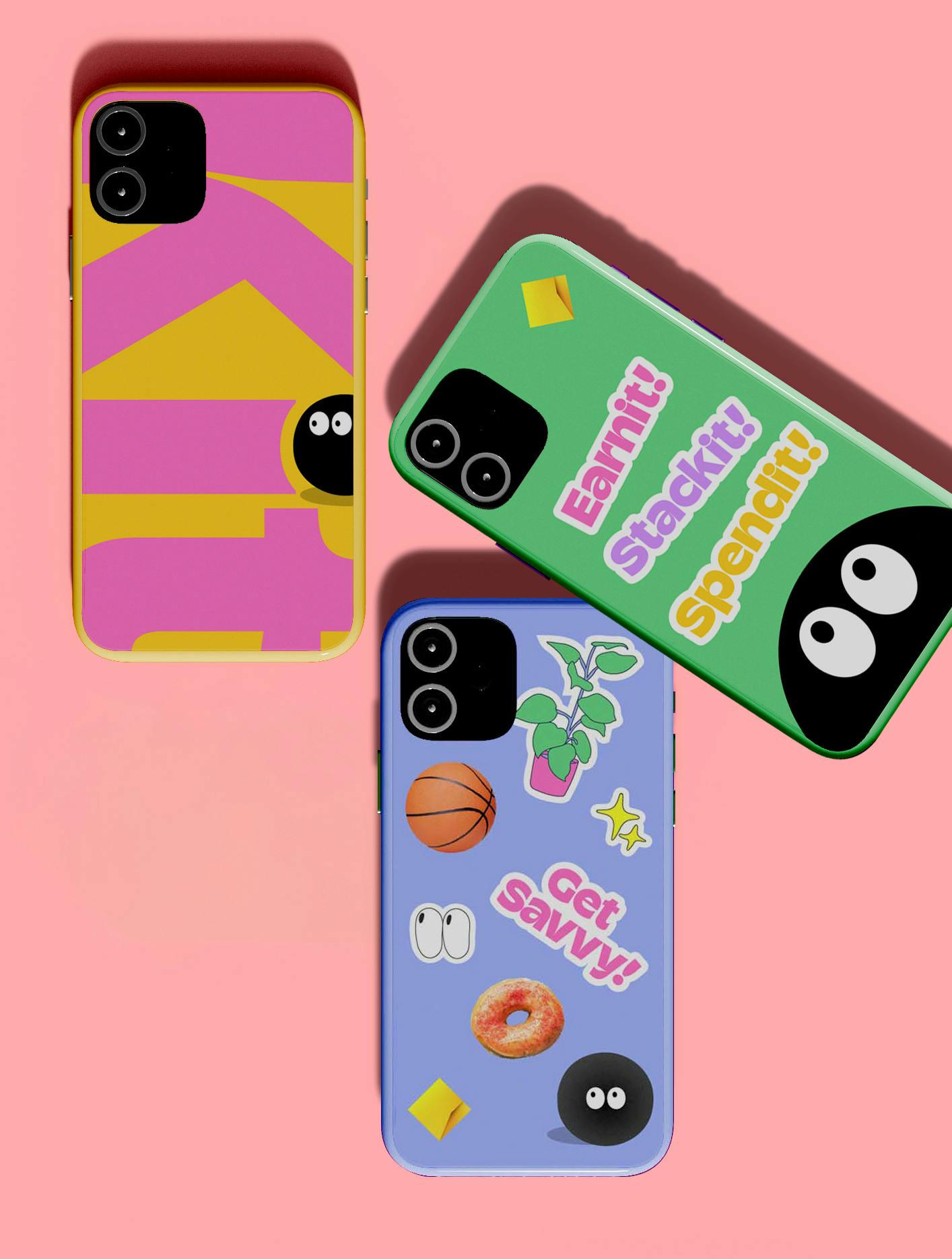
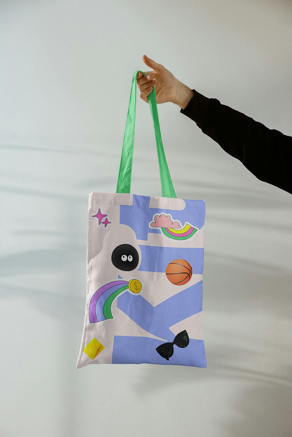
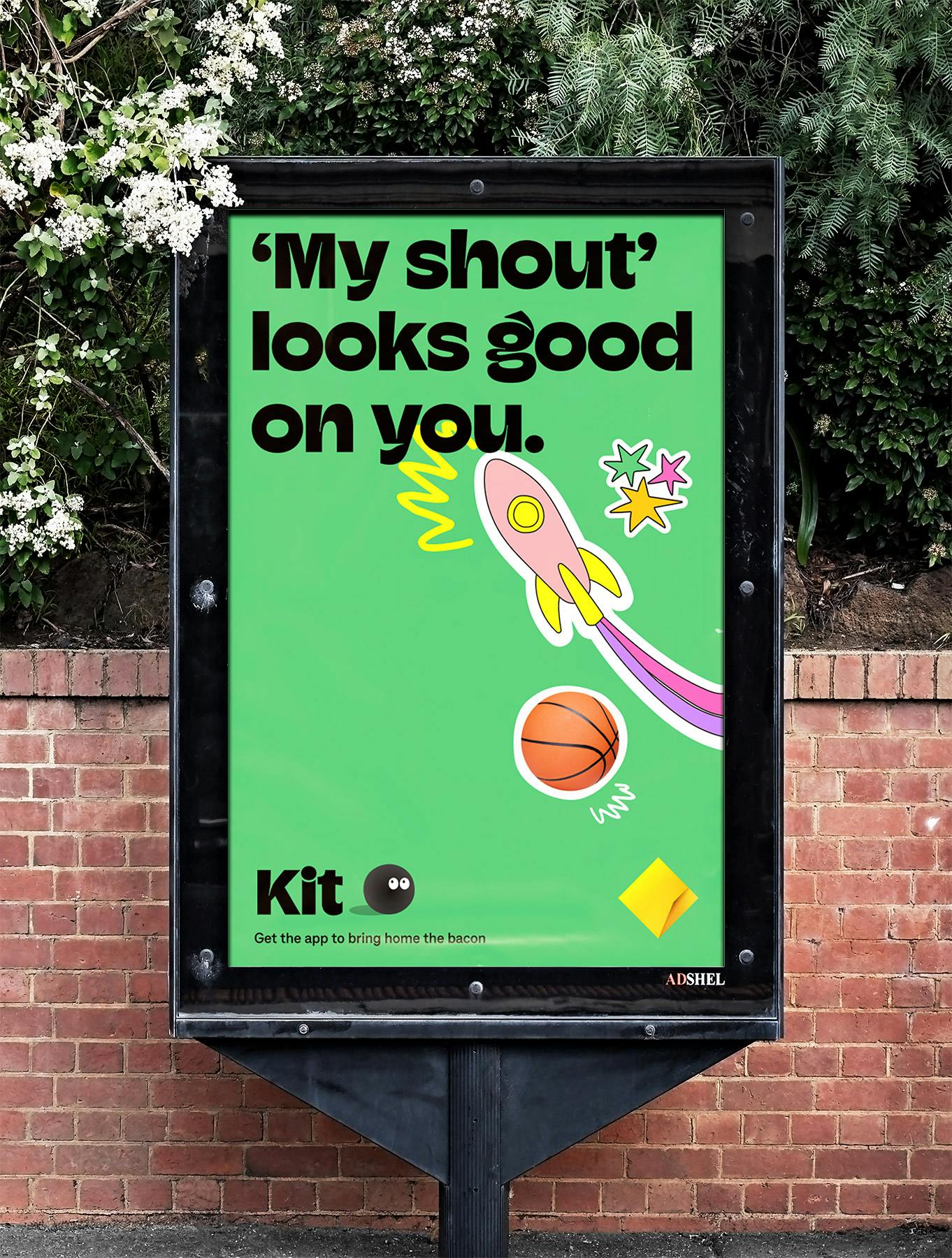
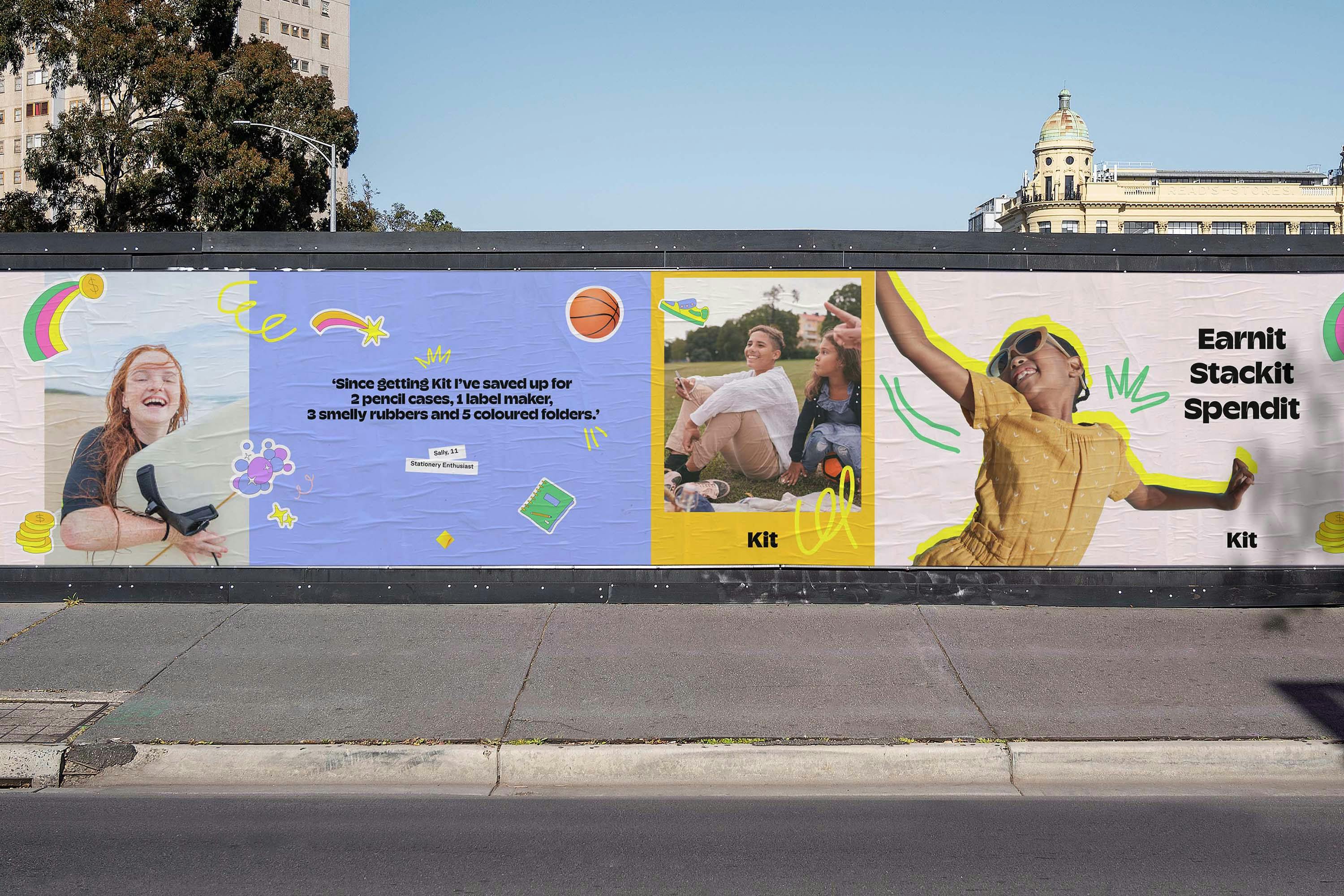
Layering illustration, photography and typography, we created a mixed-media visual language. The result emulates the idea of kids stepping into a grown-up’s world and appeals to the grown-up’s nostalgic sensibilities. The colour palette is bright and playful paired with a custom cut of Typeverything’s Champ typeface.

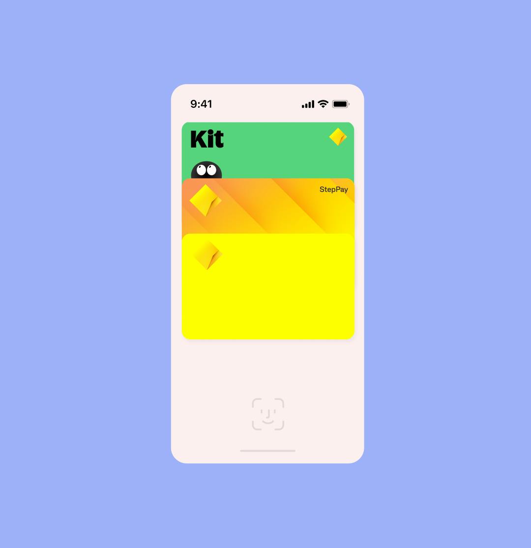
Mock-up designs only
"I think you’ve nailed it. I think it’s perfect."
Yish Koh, Managing Director, Kit an x15 venture
