Fora
Technology
It’s 2021. Your kitchen table is your desk, Alexa is your workmate and working from a communal space feels more alien than ever.
How do you captivate people with a new workspace lifestyle?
Flipping the narrative
Fora is a premium flexible office provider with sites across enviable UK locations. We started working with Fora before the pandemic took hold, and our challenge was clear: to design a brand that communicates an enhanced workspace lifestyle. The high-profile challenges facing WeWork were tainting the industry, and Fora needed to flip the narrative.
The onset of Covid-19 supercharged our challenge. Now, we needed to create a brand that would redefine flexible workspaces – in a world where shared experiences and lifestyles felt alien.
Our driving insight was Fora’s unique ability to tailor spaces and adapt both to specific Residents’ needs and to the changing context brought on by the pandemic. Bringing to life this flexibility was key when developing the brand.
Wonderful at work
We started by digging deeper into what makes Fora different to any other workspace. The answer wasn’t what you might expect. Instead of the office space itself, it was the Resident experience, the community culture and the wellness programming that happens within the square footage that really stood out. Fora workspaces are designed to create wonderful at work: wonderful ideas, wonderful interactions, wonderful new connections.
At its core, Fora is about nurturing a new relationship with the working day and reimagining what it could look like for every individual. The creative idea of ‘wonderful at work’ felt powerful and pertinent. Especially at this moment, when our working days are generally more remote, isolated and lacking inspiration.
A brand system that tells a story
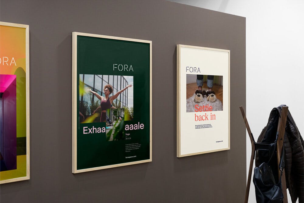
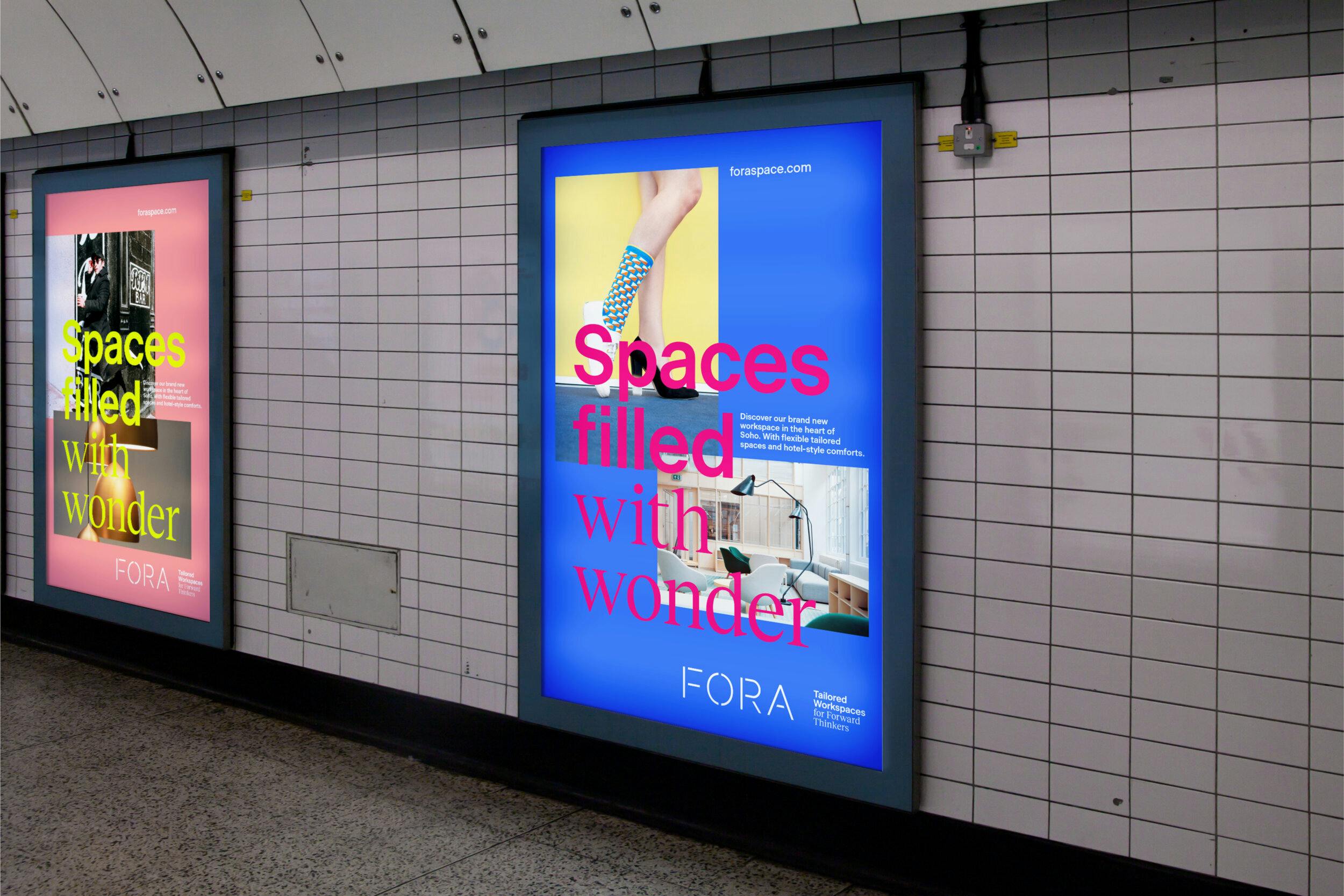
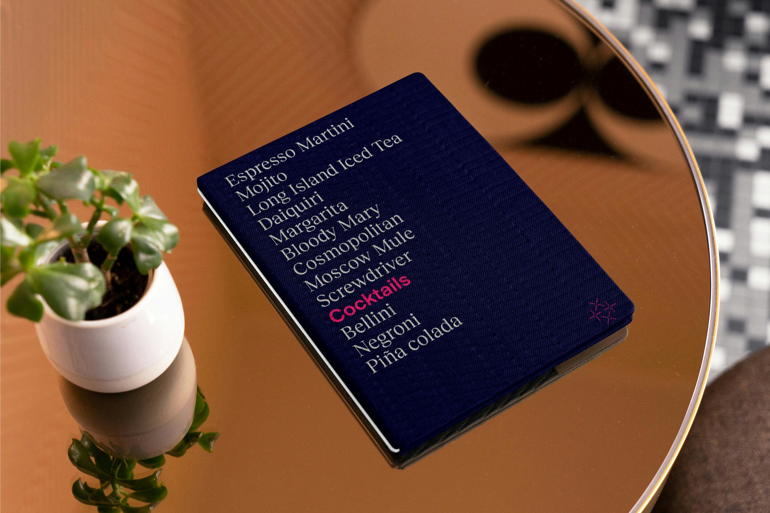
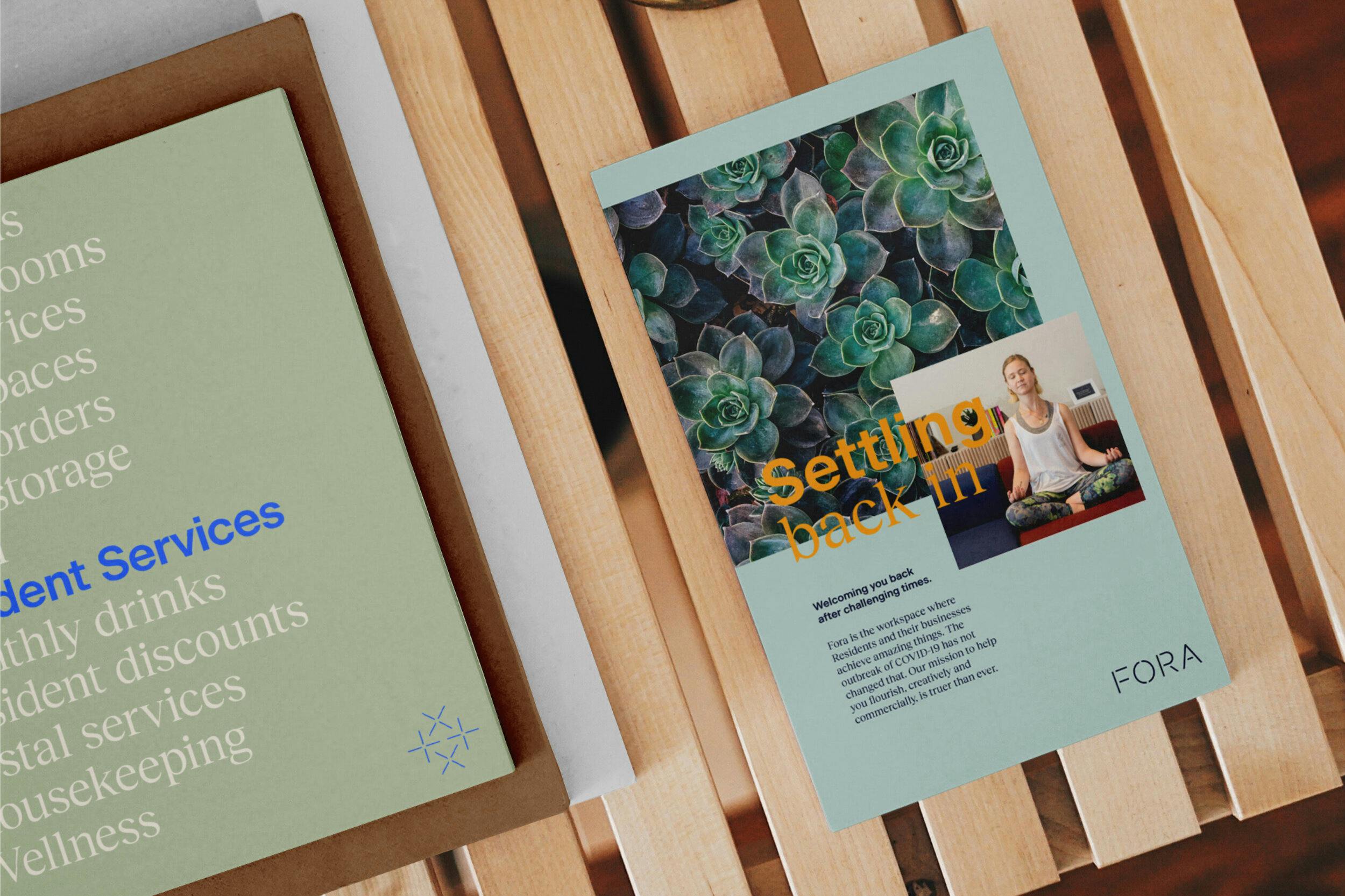
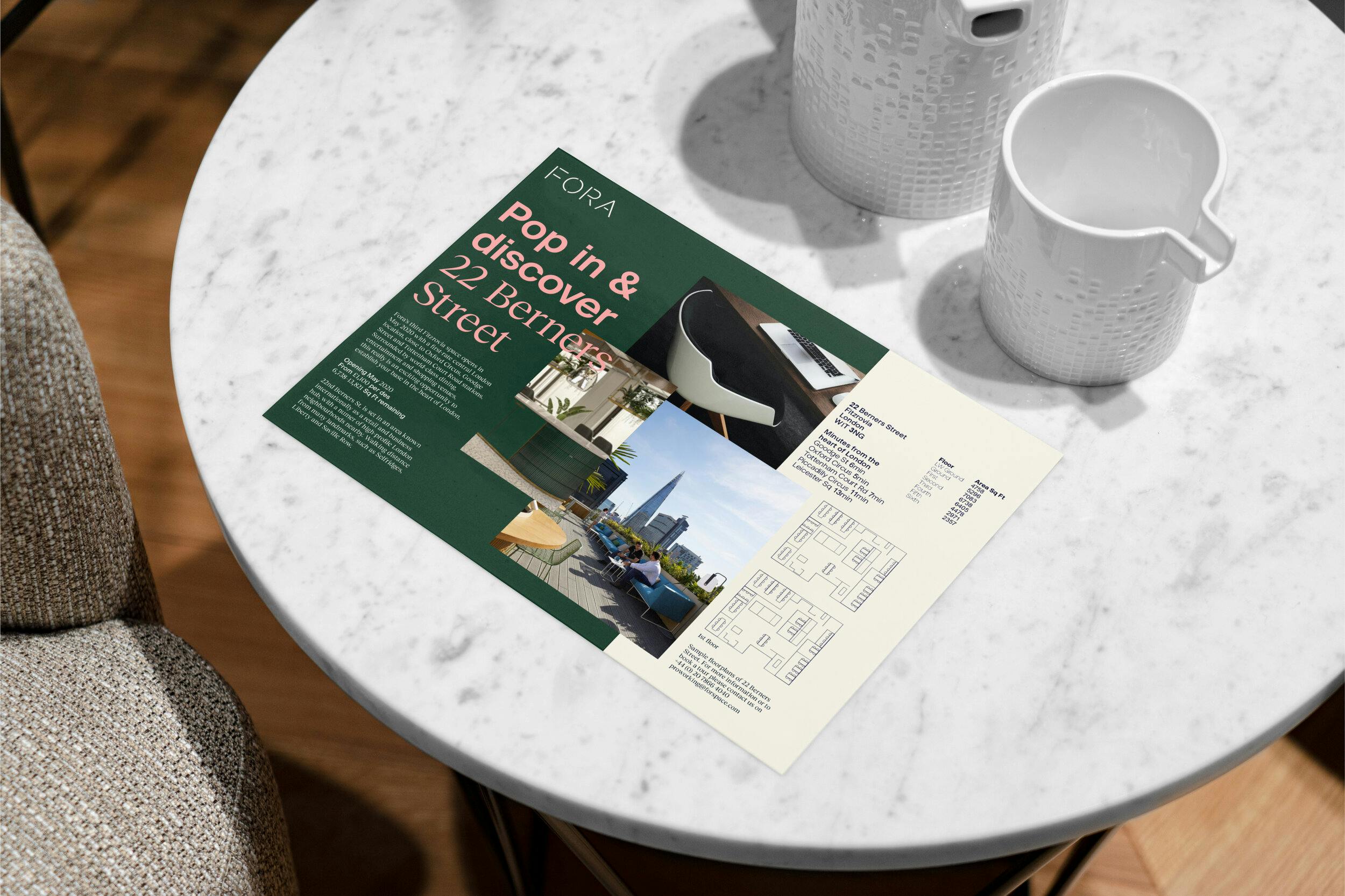
Flexibility and wonder were the key concepts driving our new identity and brand system. Each Fora space and resident has unique routines and rhythms: it was important to create a flexible brand framework that allowed us to express these rich and varied stories at every brand communication touchpoint.
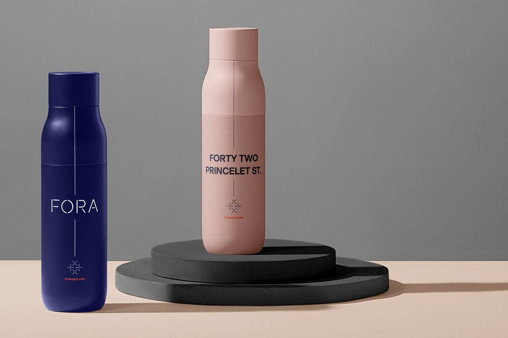
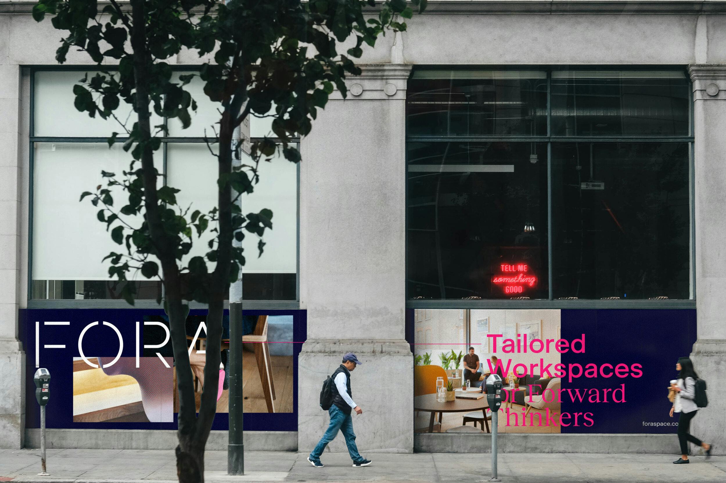
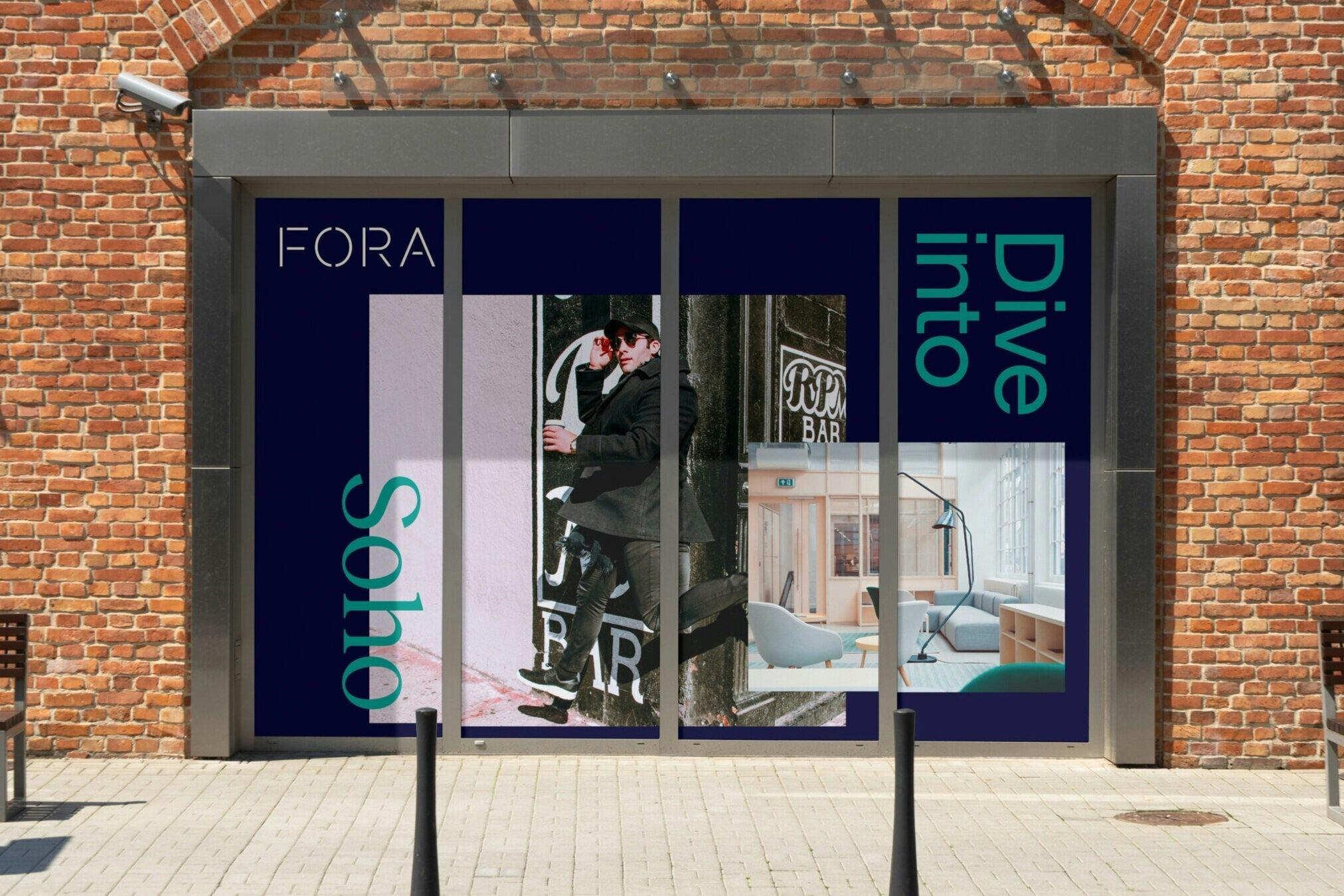
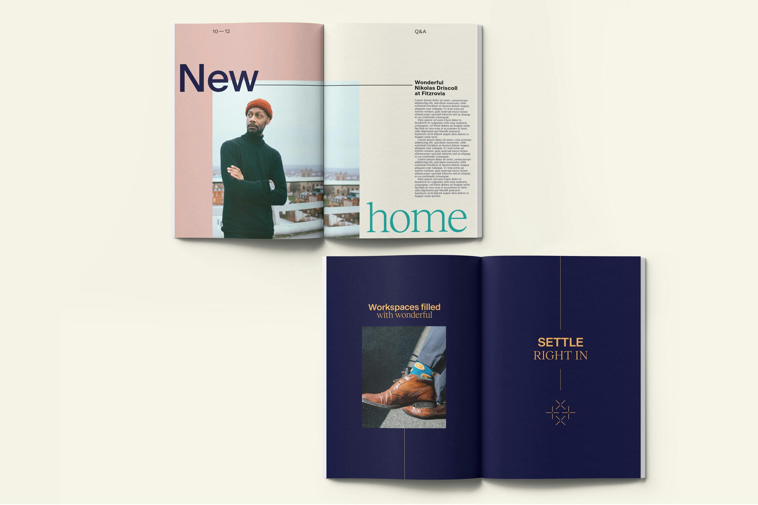
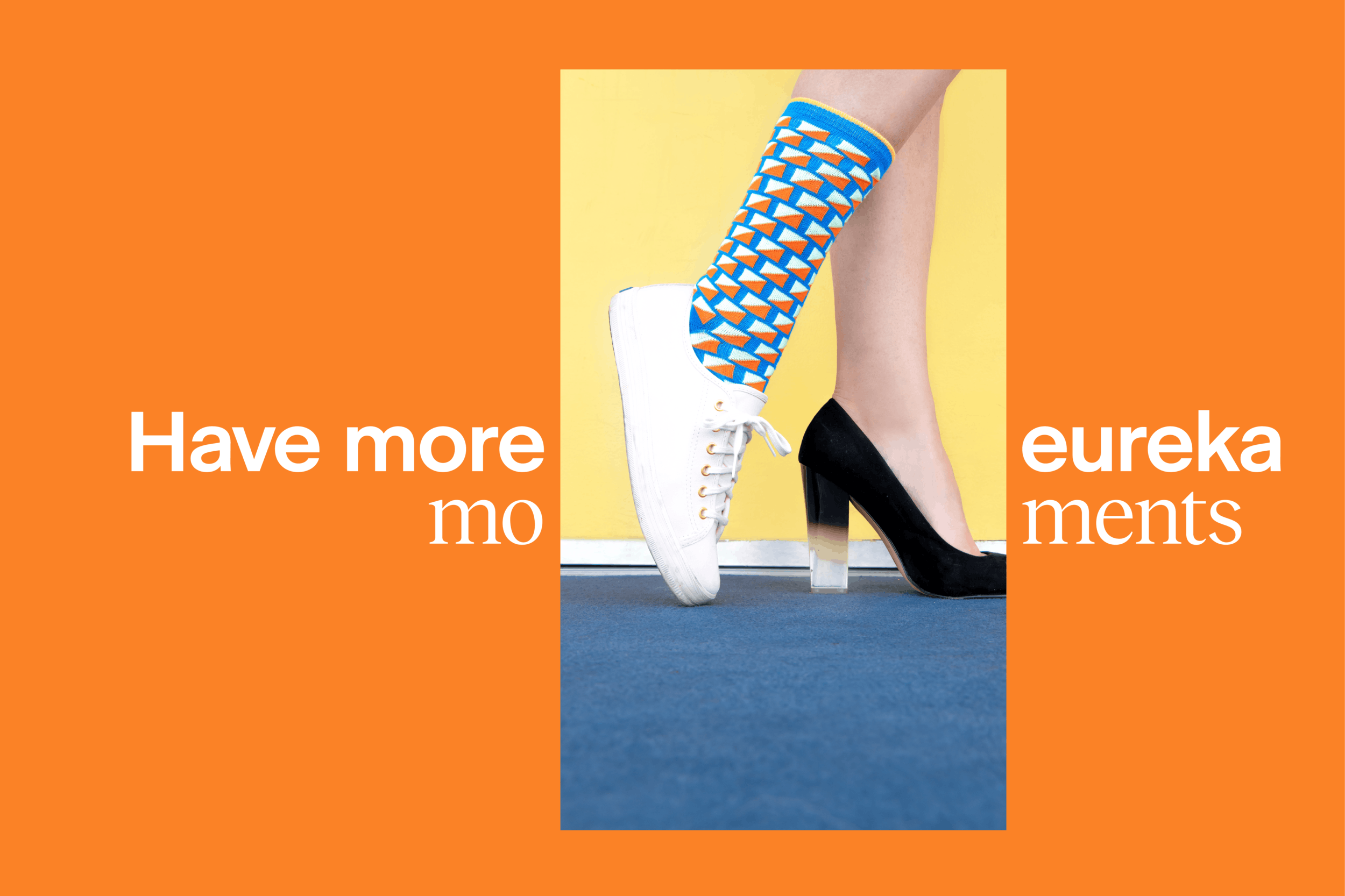
We put the Residents proudly at the forefront of Fora’s brand communications. The identity system emphasises the Resident figure by mimicking unique aspects through dynamic colour picking seen in backgrounds, typography and visual assets.
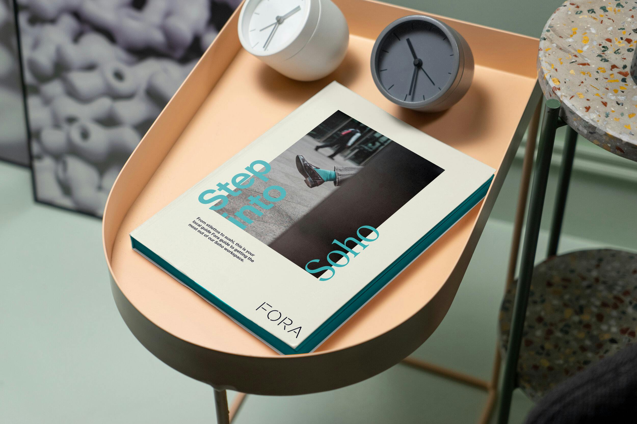
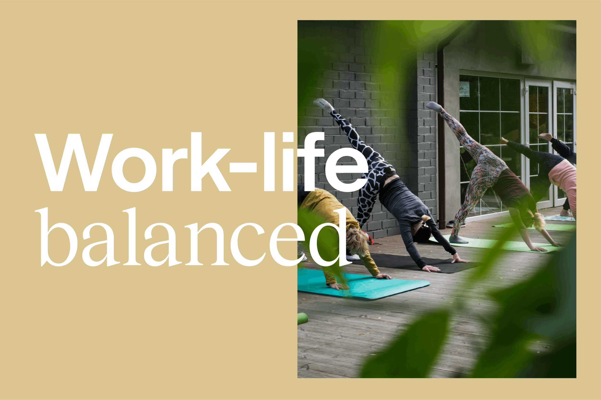
Authentic photography was key to differentiating Fora within the flexible office category. Our ambition was to use photography to tell a more human story about the diverse people and paraphernalia you can expect to encounter in at Fora . From wide-eyed entrepreneurs to Scandinavian light-scapes, highlighting these details allows the brand to celebrate what makes it different.
A fresh twist
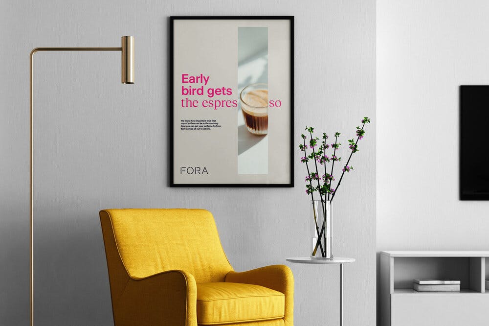
To complement the visual identity, our work on Fora’s verbal identity was instrumental in elevating it to a lifestyle brand. We created a ‘fresh and refreshing’ tonality, keeping it subtle and sophisticated but adding a natural warmth and flair to stand out from the crowd. We also developed messaging that could speak to residents and employees in the new brand voice.
Constellation campaign
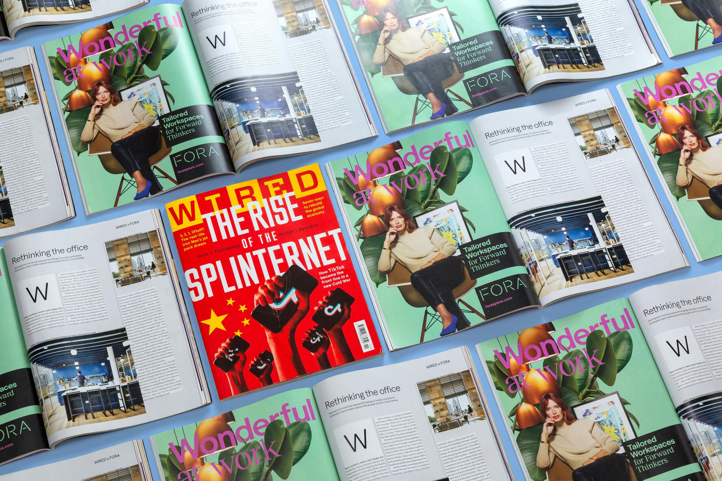
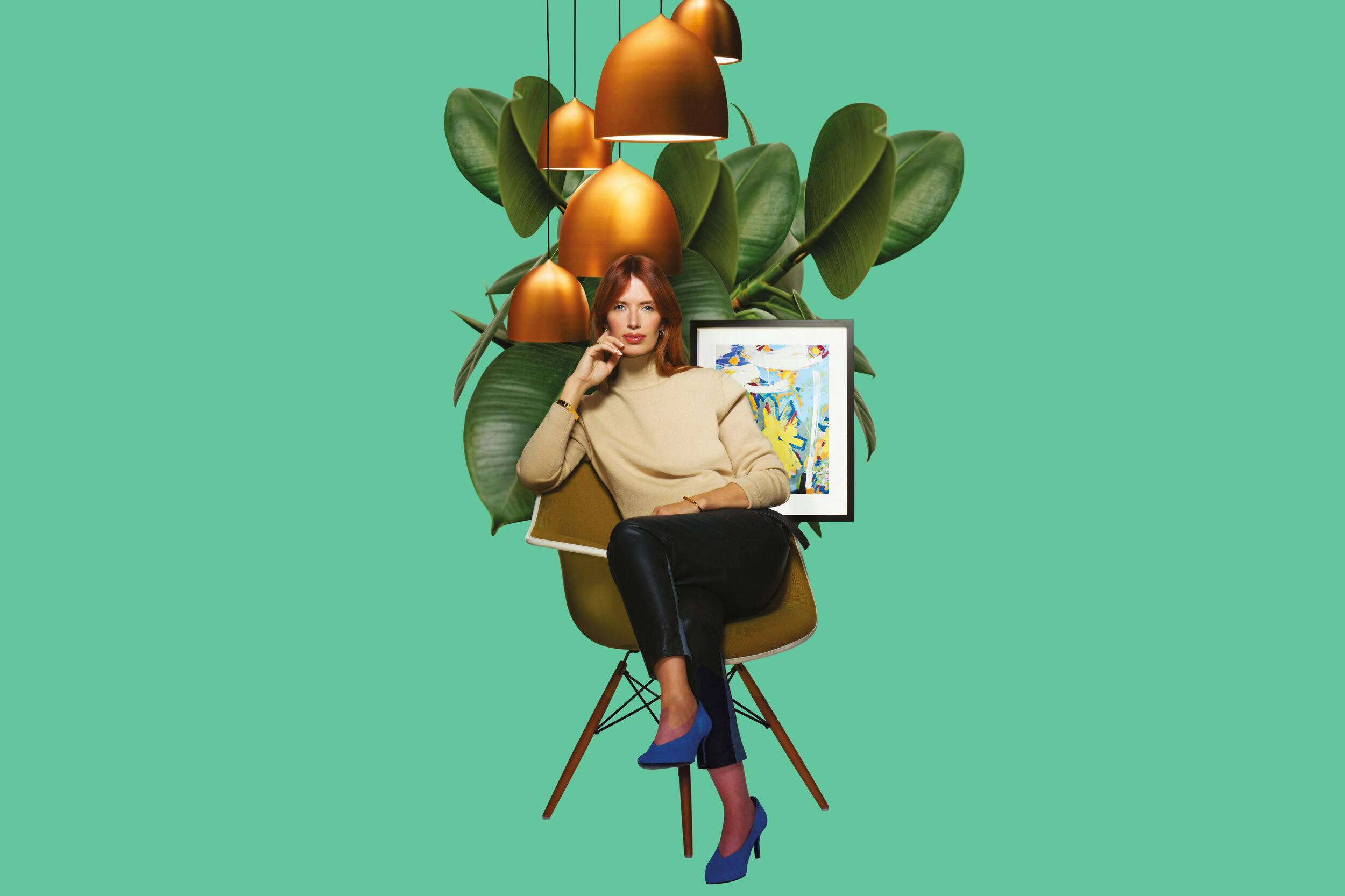
To launch the Fora brand we developed a brand campaign aesthetic that featured in WIRED magazine across digital and print. The brand campaign aesthetic was built on the idea of the unique Fora Residents’ stories, each constellation tailored to the individual. This dynamic visual style reflected the framework of the new brand system, adding a rich and distinctive new graphic language that could extend into further communications and campaigns in the future.
